work wednesday: beautiful blooms holiday card.


2010 holiday card we designed for the incredibly talented beautiful blooms team. we worked the butterfly from their logo into the ornament and made the card shine by printing it on metallic paper.

we are taking orders for custom holiday cards + gift tags up until december 5th! let us help you create something one of a kind to send out to your family + friends!

» Read More...

this week: sneak peek.

snapshots of some save the date options we are putting together for a wedding at tendenza.

» Read More...

thanksgiving wishes!


we hope you all enjoy your thanksgiving with those special people in your lives! we will be traveling for the next few days and will be back on monday. but first we're off to the grocery store for a few ingredients...danielle is baking cupcakes and cheyenne apple pies!

» Read More...

Taste of the Nation update.

I received 3 images this afternoon and I am so pleased to see my No Kid Hungry Taste of the Nation lettering in use.

I am very fortunate to work with such talented people at this time in my lettering career. The following images are courtesy of Marco Escalante, design director for Wallace Church. Marco provided me with the sketch concept for this project. It all turned out beautiful and for a great cause.


» Read More...

so inspired: design*sponge at terrain.


back in september we attended a book signing for grace bonney, creator of design*sponge (one of our most fave blogs). she was promoting her fantastic new book design*sponge at home. it is chock full of inspiration from fabulously designed apartments, to diy projects and even a few before + afters. the event took place at the one and only terrain at styers. it was one of the first chilly, fall evenings and of course terrain was beautifully decorated with every type of pumpkin and mum you could imagine. while we waited for the book signing to begin, we sipped on spiked pumpkin cider served in mason jars with adorable flag stirrers as we munched on various seasonal hors d'oeuvres. it was a great evening that helped kick start some ideas for the upcoming holidays! since everyone is preparing their homes for their thanksgiving feasts, we thought we would share a few images of the night for your own inspiration.

grace will be back in philly on december 1st! she will be doing another book signing, along with a "holi-diy" wreath-making workshop at the anthropologie home office located at the philadelphia naval yard. if interested, you can purchase your tickets by clicking here.

» Read More...

No Kid Hungry Taste of the Nation logo.


A while ago i was asked by a designer I have worked with for many years to letter a pro bono logo for a charitable cause. This was a project that I gladly accepted.

The lettering was drawn In Illustrator from the designers sketch. Quite a challenge as all the letters had to be drawn in an arced configuration. I was not able to use the envelope distort filter due to the extreme distortion of x-height and curve for every letter. A lot of trial and error in vector drawing to make the logo readable. Sometimes there are no easy vector software tricks to depend on when hand lettering a logo. It becomes a matter of drawing, more drawing and a lot more drawing to get the overall color working properly.

» Read More...

History of Color Wheel Part 2

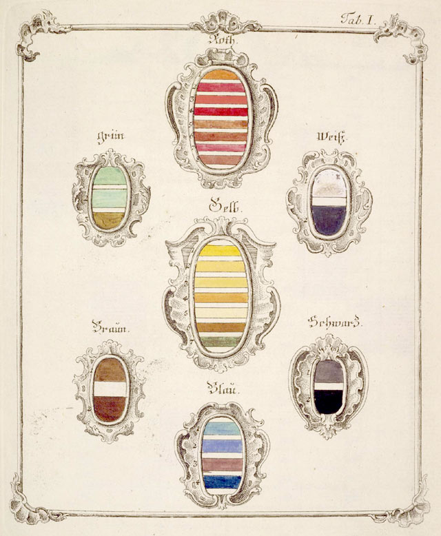
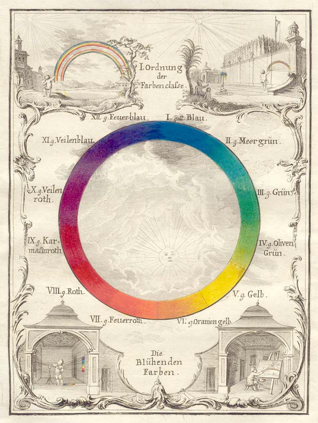
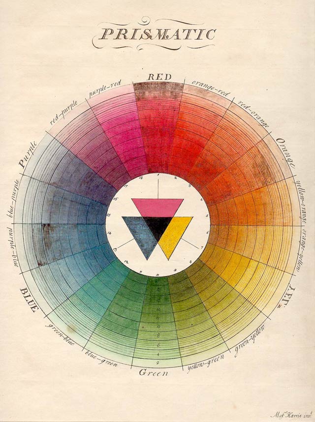
Welcome back to my salute to the gorgeous, fallible history of color wheels through the years. The first post on color wheels rolled through the mid-1800s, when Enlightenment-era values of close observation and the scientific method exploded many then-prevalent theories, while simultaneously expanding the flat color wheel into bold new shapes.


Take mathematician Tobias Mayer’s color triangle, first introduced to much hullabaloo in 1758 and shown above in a simplified version by physicist Georg Christian Lichtenberg. Mayer’s clear-eyed premise reflected his quantitative background, while proving remarkably useful for everyday color mixing by working artisans. Mayer began with the notion of three “pure” colors - red, yellow and blue - and chose cinnabar, gamboge, and azurite as the optimal pigments to represent each. He migrated these pure colors to the three corners of a triangle, then filled in the triangle’s body with progressive gradations between these pure shades. Mayer’s original triangle included 12 gradations on each side, representing the maximum degree of variance he believed the human eye could perceive; Lichtenberg slimmed this down to 7 gradations per side. In Mayer’s triangle, one could step from one pure-color corner to the next and know at each step exactly what proportion of red, yellow and blue comprised that color. The triangle’s central block had an exactly equal proportion of red, yellow and blue (r4y4b4, in Mayers’ notation). Mayers’ full color-triangle added a black-and-white axis to this mix, showing how systematic additions of these colors brightened or darkened colors.
All in all, Mayers’ algebra brought his color universe to 819 shades - woefully short of the dizzying range in any modern paint store, but still not too shabby. Mayers’ thinking spawned numerous other color triangles, including the 3-D version pictured below by Johann Heinrich Lambert.


Mayer lives on in our modern incarnations of color as CMYK (cyan-magenta-yellow-black/white). Any crackling cathode-ray television with its glowing color pixels operates more or less according to his precepts.


The painter Philipp Otto Runge was the next German to corner the market on color wheels and their related manifestations. His 1807 model took Mayer’s notion of three “pure” colors, plus black-and-white, and spread these ideas over and inside a 3-D color sphere (complete with cross-sectioning). Goethe gave Runge a conclusive shout-out in his 1810 landmark work, Theory of Colors, but Runge’s color notoriety was short-lived. In 1839, his model gave way to Michel Eugène Chevreul’s hemispherical system (below).


Chevreul arranged his 72 colors in a hemisphere, with similar proportional relationships between shades as those posited by Mayer. The use of black and white as a lightening or darkening agent was alluringly called the “nero” factor. Chevreul’s biggest scientific accomplishments spill beyond his color hemisphere: a past-master of animal fats, he invented an early form of soap and pioneered the study of gerontology while living himself to age 102. He also described a phenomenon now called Chevreul’s illusion: the way two identical colors of different intensities, when placed adjacent to each other, seem brighter at the edge where they join.


In 1900, Albert Henry Munsell’s cylindrical system (above), brought color theory into the twentieth century with an appropriately futuristic visual model. Munsell opted for a three-dimensional cylinder, in which the three axes showed hue, value (lightness or darkness), and chroma (color purity). In quantifying color using these three values, Munsell’s model described colors more scientifically than previous models, which themselves cracked the color wheel concept wide open in favor of more ersatz shapes: Hermann von Helmholtz’s cone in 1860, William Benson’s tilted cube in 1868, and August Kirschmann’s grandiloquent sounding “slanted double-cone” from 1895.
Munsell’s color cylinder was the stake driven in the heart of the history of daffy color wheels. A few models have emerged since Munsell - notably CIELAB and CIECAM2 - but Munsell’s system is still used by, among others, ANSI to identify skin and hair colors for forensic pathology, the USGS for matching soil colors, in prosthodontics for selecting tooth shades for dental restorations, and by breweries for matching beer colors.
Have color wheels rolled entirely out of the historical frame? Mercifully, not quite. COLOURLovers spies unusual color wheels in everyday life, like this panoply arranged by Bright Lights Little City (an online shop specializing in lampshades made of cocktail-umbrellas). In an equally liquid vein, MOMA offers its Color Wheel Stick Umbrella. Design Observer co-founder Jessica Helfand praised the infinity variety of wheels in design in her book Reinventing the Wheel.


However inadequate, scientifically speaking, it is to describe the color-spectrum using a wheel-shaped model, there’s an irresistible fitness about marrying circles with color. As a geometric figure, circles possess a certain strength, a self-contained quality in which a smooth, unperturbed body can be imagined to hold an entire universe. Sometimes the pod will crack, spilling its contents with rampant energy, or maybe the circle holds indefinitely. For an entity as slippery and ubiquitous as color, only a circle can be imagined as a perfect enough shape to contain all of it.


» Read More...

happy things.


it's hard to believe thanksgiving is next week already. we are both looking forward to spending some much needed time with our family and all of the comfort food that comes along with it! 

we feel that the table setting and decor is just as important as the turkey and sweet potatoes. here are few beautiful pieces to compliment your turkey day...

{a} announce the holiday menu to guests with this diy chalkboard menu by hgtv; {b} top your pumpkin pie with a thankful note to the hostess by local philly illustrator kathryn white; {c} make your guests feel special with these vintage letterpressed turkey place cards by word letterpress; {d} distress some pumpkins still lying around the house with simple paint and sandpaper; step by steps by centsational girl; {e} serve your turkey with style on this gold give thanks platter by west elm.

we believe that there is always something to be thankful for... we are so thankful for our family, friends, clients, readers and getting to do what we love everyday!

» Read More...

Typo-Graphical logo


I recently created a new logo for Typo-Graphical. An article showing the process can be viewed here. John also included a brief interview following the logo development process.

One of my favorite logo projects in a while and definitely an improvment from what John initially had oh his site. This logo will hold up aswell designed lettering for many years ahead.

» Read More...

My thought for this morning.

» Read More...

work wednesday: jennifer's baby shower.

jennifer's safari themed baby shower invitation! we drew color and image inspiration from her adorable carter's bedding. we loved working with these super vibrant colors and happy little animals! 

» Read More...

Beautiful Stuff


Beautiful Stuff is a lettering piece for the opening image of an upcoming article featuring my work. Lot of overlays with translucent paper to figure out the flow and compostion. Additional changes happened while lettering in Illustrator.

» Read More...

Woohoo!! My Letterpressed Christmas Cards were featured on Martha Stewart.com's top cards of the season!!

http://ourfinds.marthastewart.com/2011/11/07/holiday-cards-galore/#comments

» Read More...

so inspired: emilie + stephen's wedding.

we are mixing mondays up a bit. in addition to our sneak peeks we are introducing so inspired. everyone needs a little inspiration, especially at the start of a long week. this post will be a mix of things we see and love that inspire us to do what we do. {images to fill up your pinterest boards!} we begin with a fabulous handcrafted wedding by our very talented friends emilie + stephen...


invite + reply postcard designed by steve and screen printed with emilie's help.


library card inspired program. designed by allie of petite rue.


photos of the beautiful night at the german society of pennsylvania. captured by the girls of love me do photography.


» Read More...

happy things.


happy 11.11.11! because dee's husband, pat, had shoulder surgery this morning we have collected some fabulous items for any friend or loved one that is in need of cheering up due to an illness or recovery.

{a} send an adorable get well wish by auri cards + pouches; {b} cool down a fever with this robert gordon colorful, vintage icepack; {c} get some giggles with these mustache band aids from archie mcphee; {d} send your love with a stunning bouquet from sullivan owen; {e} heal aches + pains with this homemade rice heating pad by just another hang up; {f} cheer up any patient with vanilla and baileys get well cupcakes by cutie cupcakes; {g} perfect reading material for any sicky with style, the perfectly imperfect home, how to decorate & live well by deborah needleman

» Read More...

History of Color Wheel Part 1

How many ways can you reshuffle the rainbow? Three, as a matter of fact, if modern color theory is to be believed: Pantone numbers for print designers and brand managers; hex, RGB, and CMYK values for web designers; and CIELAB and CIECAM02 color models for the scientific community. But while the science of color models is largely settled, all that rigorous theory still doesn’t quite squeeze out the sense of fallible humanity underpinning the history of the color wheel.
All it used to take was a load of brilliant chutzpah, a dogged sense of orderliness, and just a smidgen of actual science to impose your personal order over the color universe. This post and the next salute the color giants of centuries past and their often-fanciful, sometimes inaccurate, but always wildly rollicking wheels.


Slightly dotty in the science department but much-loved by generations of art historians and philosophers, Johann Wolfgang von Goethe's Theory of Colours coincided with this wheel (left) he designed in 1810. In the book, Goethe rebutted Newton’s color-spectrum theory by imagining darkness not just as absence of light but as its own active force. As light struck dark, in Goethe’s view, their battle threw off observable sparks of color.
During the week, Goethe devoted himself to such legend-building stuff as inventing the Italian tour, discovering the human intermaxillary bone, and giving voice to Sturm und Drang and Weltliteratur. But Goethe spent his weekends breathing on glass panes, prodding chocolate-froth bubbles, and flapping his arms in broad daylight, then jotting down how colors changed in each observation. The resulting catalog is an impressive confluence of exhaustive scientific inquiry and pointillistic word-art.
But Goethe had quite a few predecessors, some more wedded to the wheel-shape in quantifying color than others. (It’s an oddly Germanic list, too, these would-be color scientists.) In 1686, Richard Waller’s "Table of Physiological Colors Both Mixt and Simple" offered a handy table for cross-referencing colors one might find in nature samples. If a shade didn’t match exactly, Waller explained, it was a simple matter to locate where on the table’s color-continuum that shade might fall:


The table format, as is obvious to us today, had serious limits primarily because of the vast number of shades that fell between the divisions in color in any table. Even vast catalogues like the Pantone-esque Viennese Color Collection or Complete Book of Samples of all Natural, Basic, and Combined Colors, compiled by Johann Ferdinand Ritter von Schönfeld, in 1794, couldn’t catalogue every single color – and comprehensive catalogues also tended to be huge, unwieldy and expensive.


In 1769, Jacob Christian Schäffer – a naturalist, inventor and German Evangelical superintendent of Regensburg – tackled this natural limitation of the table format in his own color system. He gave blue, red, and yellow pride of place in his hierarchy, explaining how these primary colors could be combined to create a multitude of shades in between:


Photograph © 2002 Board of Trustees, National Gallery of Art, Washington, D.C. via The Creation of Color in Eighteenth Century Europe by Sarah Lowengard
No wonder color scientists hewed back towards color wheels and other means of suggesting an infinite color continuum. [Image via] Ignaz SchiffermĂĽller was a Viennese butterfly expert whose 1775 color wheel was designed to help him accurately identify the colors he encountered in nature studies:


The color wheel above rolled hard on the heels of Moses Harris’ 1766 model from the Natural Systems of Colors. This particularly fine specimen was the British entomologist’s attempt to explain the color interplay he saw in his own favorite kind of bugs, flies:


Although it would be some time before the color wheels concept finally took over, the notion of suggesting color relationships through smarter information design had taken root.

Next Time History Of Color Wheel Part Two

» Read More...

work wednesday: sarah + faiz.


sarah + faiz were married at the horticulture center in fairmount park, philadelphia on october 29th. that was the day the east coast was hit with a very early snowstorm. despite the unexpected weather they had a gorgeous ceremony and reception in the warm and cozy greenhouse.

sarah + faiz requested their invite package convey a casual tone while including nature and touches of persian design in honor of faiz's background. we achieved nature with the drawn tree and textured paper and persian elements with the vivid magenta and ornate frames used throughout the package. the twine keeps the loose pieces casually bundled together. the mailing envelopes were hand addressed by melanie from gracefully addressed.  

below are a few of our favorite images captured by otto schulze and michael ash. see more of this spectacular celebration styled by the ladies of styled creative here. 

how do you like our new column width?! bigger photos are always better!


» Read More...

Search This Blog

Best Artikel

Powered by Blogger.