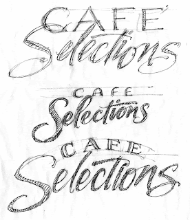

A recent project for signage of upscale cafe items. The goal was to create a loose flowing script for consumers in a fast pace lifestyle. CAFE was designed with small pin serifs and inlines for elegance. The irregular drop line of Selections allowed a light weight script to be viewed by consumers at a distance. Both words read as one unit with the loop of the S & C and the top of the l tucked into the opening of the A.
Elegant Rhythm for Upscale Cafe Items
Subscribe to:
Post Comments (Atom)


0 comments:
Post a Comment