Look at these fantastic milk packaging design and how creative they get. Some of them are really functional. while some others not so much. Enjoy
This roundup features several different types of unique milk packaging designs, all of which I find to be of the highest quality.
Soy Mamelle: The packaging shape is that aimed to represent that of a cow’s udder, instantly leading the user to what the product is inside the packaging. Whilst it moves away from the usual milk bottle, we still know what it is inside.
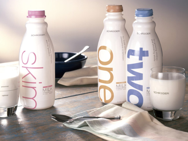
Shroeder: The use of the words One, Two, Whole, and Skim each scaled reflect the fat level of the milk, this packaging was designed by Capsule.
Organic Farm: This was designed by Lindsay Perkins, it was inspired by a small, local, organic farm in rural Maine.
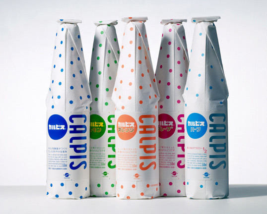
Calpis: Made in japan originally from 1922.
Gotta Moo: Designed by recent graduate Narani Kannan, the design focuses on the most eco-friendly method for milk packaging.
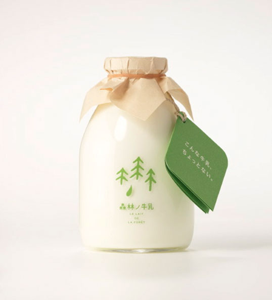
Forest-Milk: Designed by rise design office, the tree graphic reflects the typography. (Nominated for a Japanese 2009 Good Design Award.)
Cravendale Milk: These are just simple concept illustrations designed by student, Sanna Annuka.
Milk: Designed by David Fung, in his words; “The goal of this redesign was to use a standard milk carton as the canvas to create a clean, modern, and functional design.”
Milk Carton: Designed by raw edge studio, this design aims to merge both form and function.
HattoMonkey: Designed by design studio HattonMonkey, this is a great typography inspired piece of packaging.
Teet: Aimed to grab your attention this whole and chocolate milk design is sure to get head turning, by Ashley Linnenbank.

Yuliya Brodskay:Not know for her packaging designs, but this design is completely left field, and although it may not be too practical.
Ecolean:Dubbed as “A Lighter Approach to Packaging”.
Tripple Red:“The red-and-white pattern is reminiscent of a stitched, antique tablecloth, but the magic comes into play when the design element transforms into MILK when read from afar.”
Julien De Repentigny:He describes the idea to be “an experiement in carboard packaging, as well as communication.”
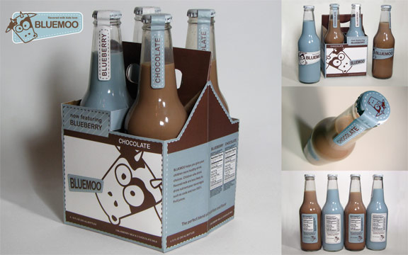
Blue Moo:Design by Dan Kunitz, the idea is that older children would be attracted to the milk as it is packaged in a more adult style packaging.
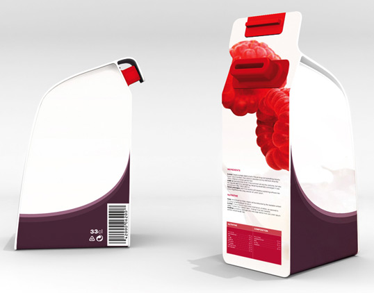
Feez:This has been designed by HvingtQuatre, they describe the design to be “The milk adorns the packaging, the tasty fruit is brought out on the milk and on the opening that enables the drinking.”




0 comments:
Post a Comment