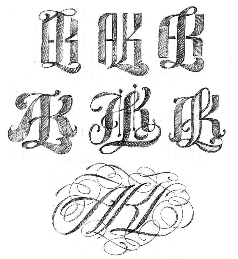
I had some more free time to continue working on the AKL logos. My 3rd logo attempt was OK but I wanted something more complex. I did some additional sketching and picked a few roughs to refine. However, none of the roughs held my interest until I began playing with a spencerian style. I did approximately 50 quick spencerian sketches and ended up with only one decent version to import as an Illustrator template. While drawing in Illustrator and zooming out to view the lettering at small scale the overall contrast was not the best so I reworked the composition over and over until I had something that held up visually.
The 3rd logo in the project.
AKL Final Logo
Subscribe to:
Post Comments (Atom)


0 comments:
Post a Comment