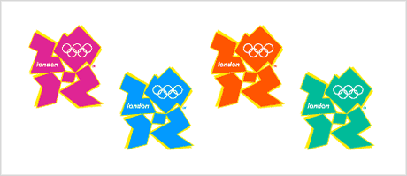
Today saw the launch of London’s 2012 Olympic logo.The jagged emblem, based on the date 2012, comes in a series of shades of pink, blue, green and orange and will evolve in the run-up to the Games.It shows the numbers 2012 in a design aiming to appeal to today’s Internet generation. Sebastian Coe, chairman of London’s 2012 organising committee, said: “It is an invitation to take part and be involved.”
The brand identity was designed by Wolff Olins. Given how they were chosen as the designers over a year ago, I find the results disappointing.
Quite a few others are showing their dislike of the new logo too. .
What do you think?
London 2012 Olympics logo. Is it a disaster?
Subscribe to:
Post Comments (Atom)


0 comments:
Post a Comment