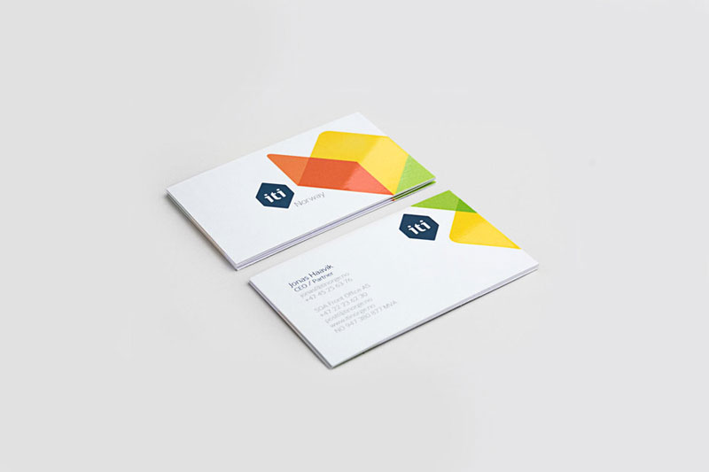
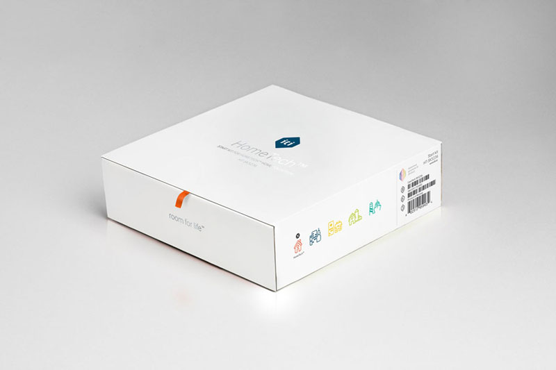
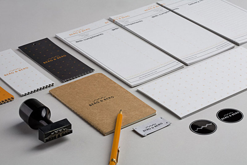
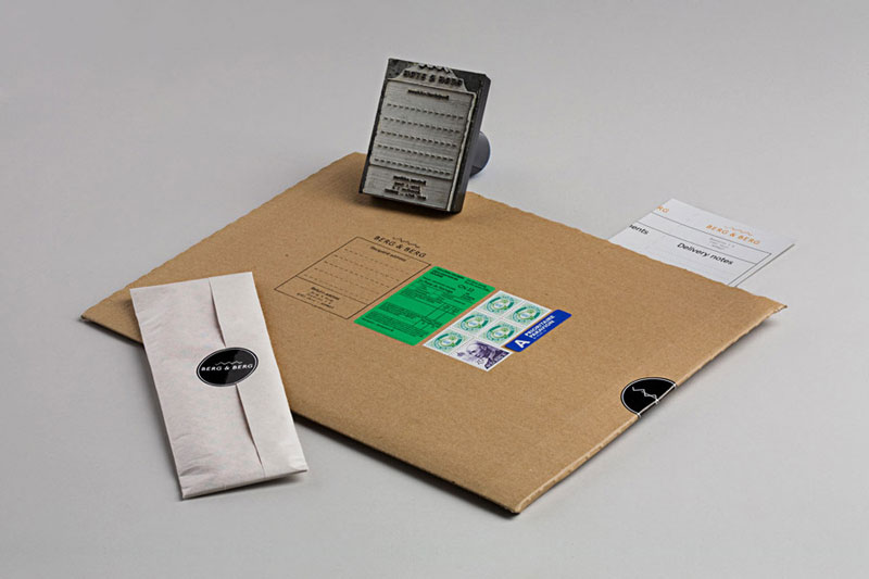
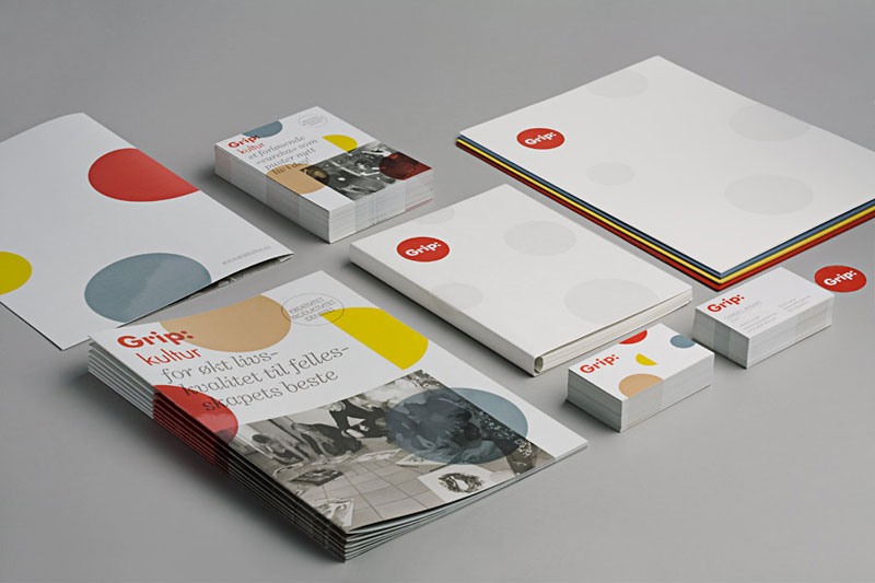
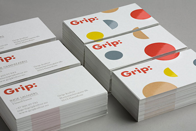
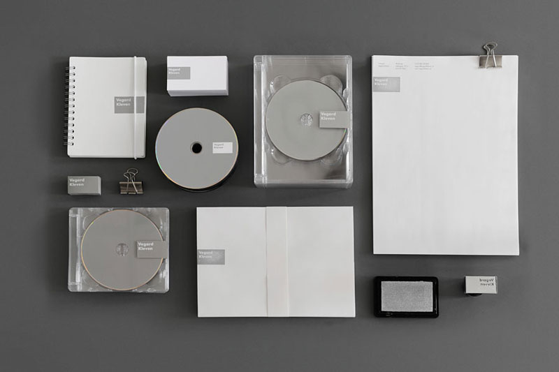
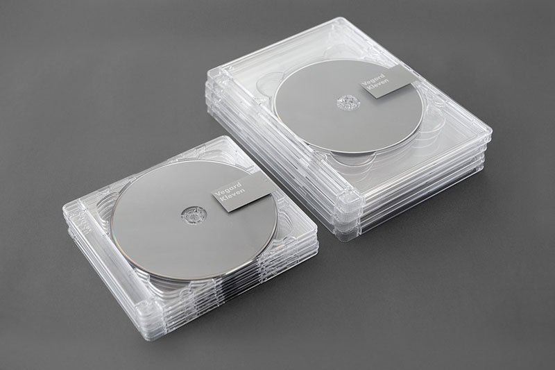
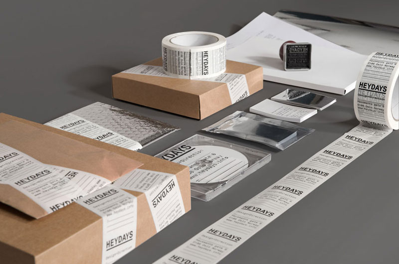
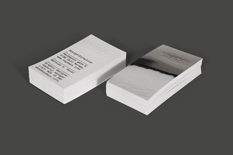
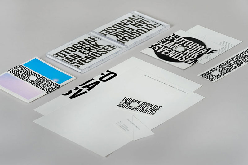
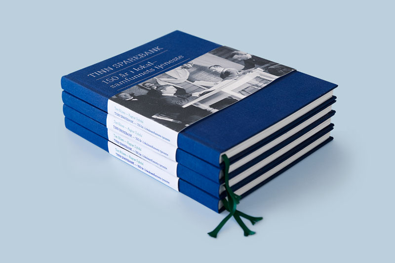
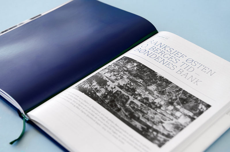
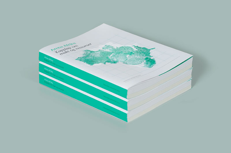
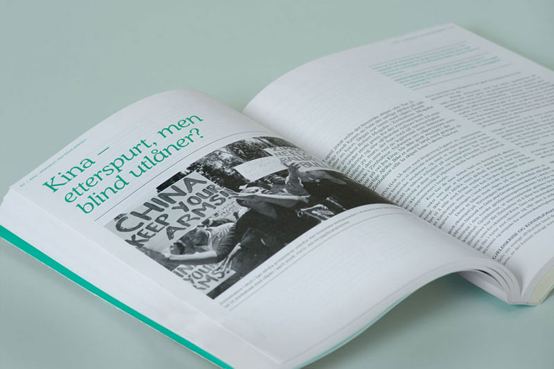
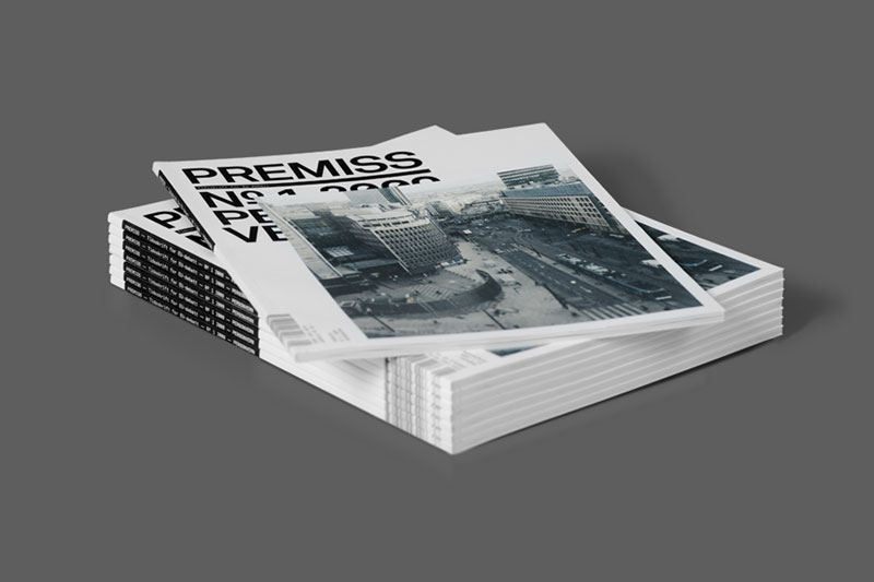
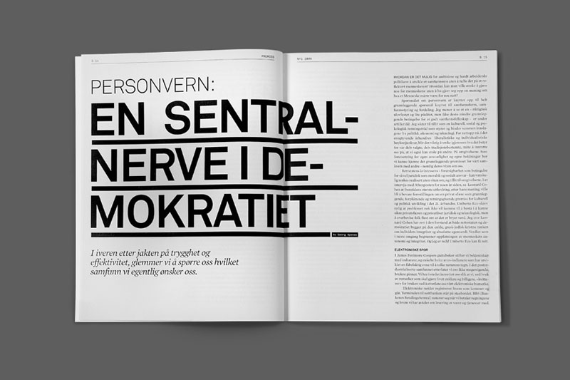
I always liked simple ,sophisticated and clean designs where the colors don't distract from the overall design and just work harmonically with it. I found these cool branding designs from Graphic Exchange website. A good reference for those who are intro branding design.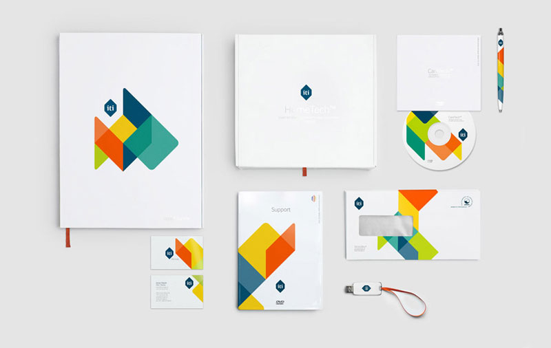

 | |||
 | |||
 | |||
 | |||
 | |||
 | |||
 | |||
 | |||
 | |||
| |||
 |
 | |||
 | |||
 | |||
 | |||
 | |||
 | |||
| |||
| www.heydays.info |
| Graphic exchange with my friend Reno Orange |
| posted on personal section on january 14th |
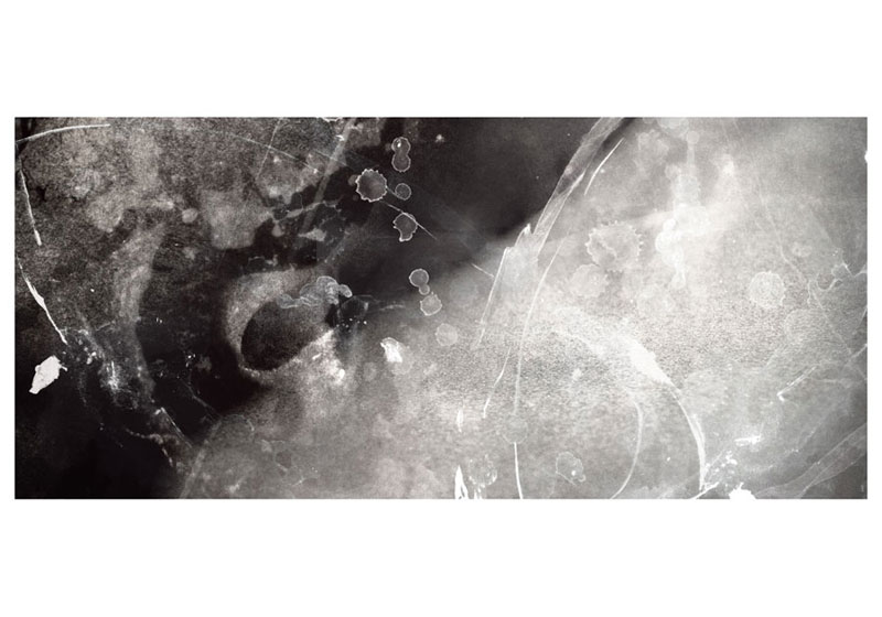
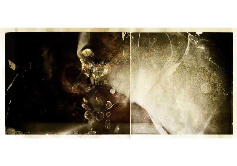
| Just having some fun like we did some years ago with my friend Reno Orange... A battle, as it is sometimes called... I start working on an image he sent me a while back (I ask him what it is, he tells me, I draw it in photoshop with textures and things I have...)... I work on it, resend it to him, etc... until we get this final image you can see on the splash page today... |
| Image 01 : Reno |
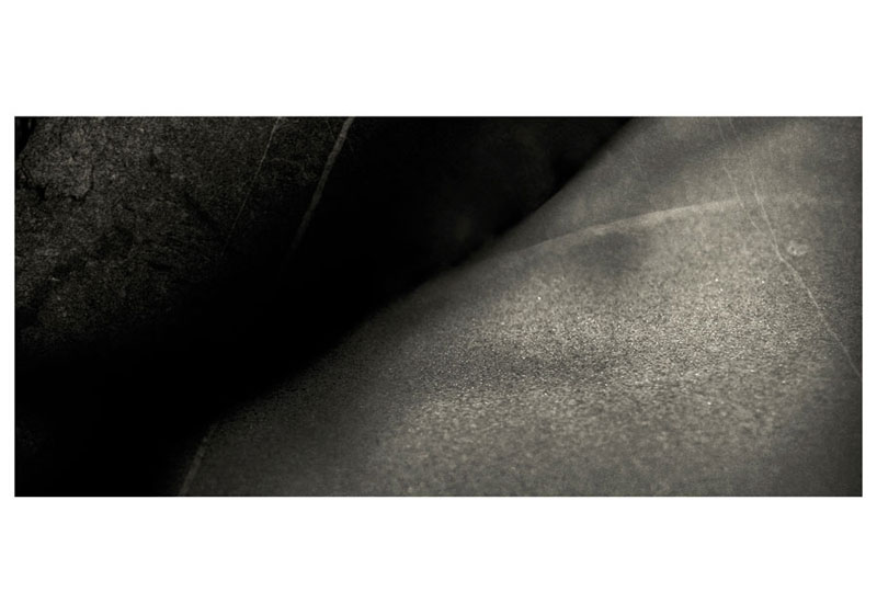 |
Image 02 : me |
 |
| Image 03 : Reno |
 |
| Image 04 : me |
 |
| Image 05 : Reno |
 |
| See image in big here. |
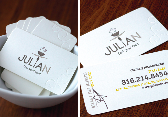
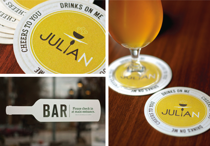
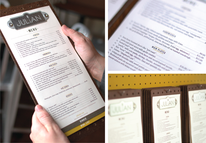
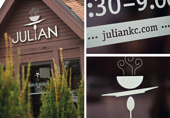
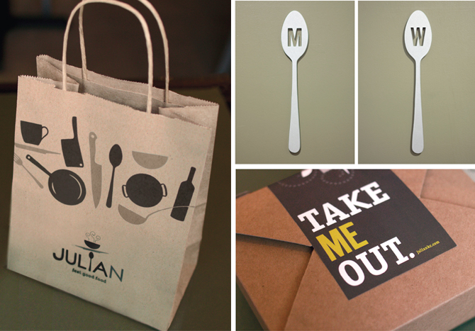
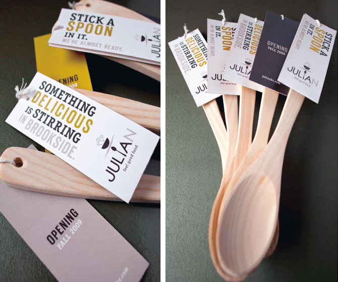
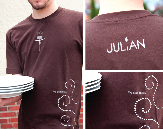
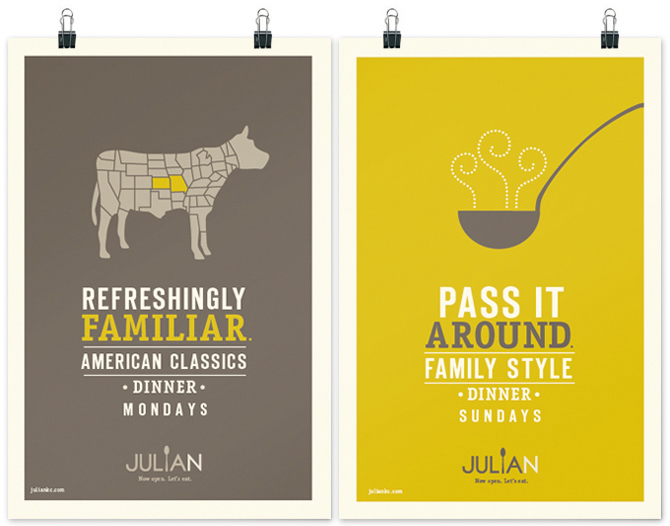
| Julian / Restaurant Branding | ||
| posted in identity section on january 29th | ||
 | ||
 | ||
 | ||
 | ||
 | ||
 | ||
| ||
| by Jordan Gray | Nathaniel Cooper | Brent Anderson | Photography by Gabe Hopkins |
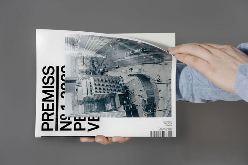
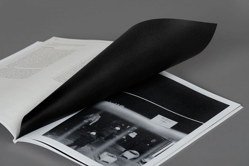
| Anouk Rehorek |
| posted in print section on january 28th |
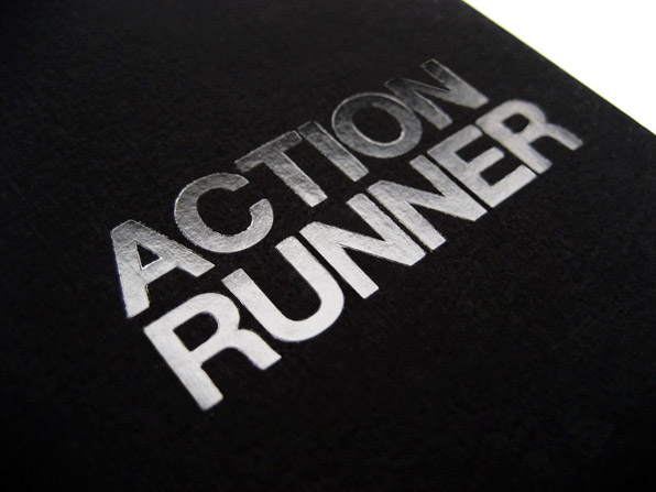
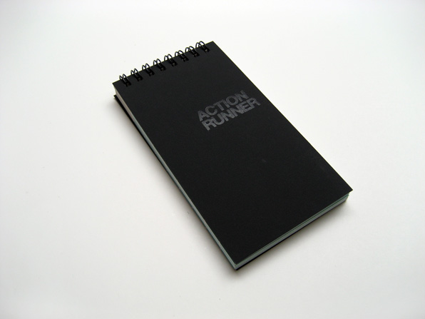
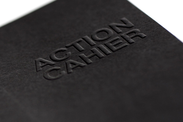
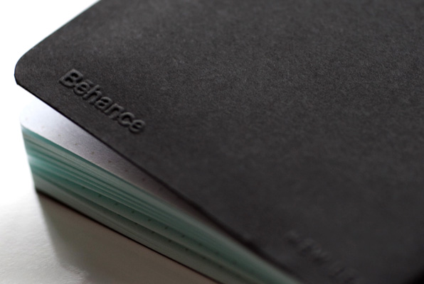
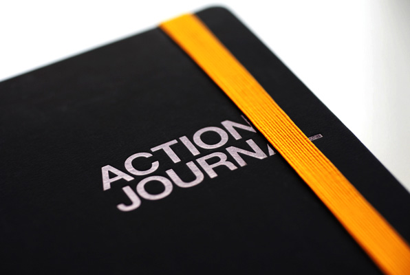
Most of you know Behance for their Creative Network... And maybe some of you have heard about the nice products their team develops: "Action Method", to help designer organize their ideas... Expanding their line of notebooks, they just created three new "eco-friendly" models to encourage productivity. Back to a nice collection of printed products..." |
 |
 |
 |
 |
 |
| www.creativesoutfitter.com |


0 comments:
Post a Comment