A collection of posters about design – created for a “What Is Design” contest – is a fun, humorous and insightful look into the minds of artists.
And You Can Take That to the Bank – Juanma Teixido
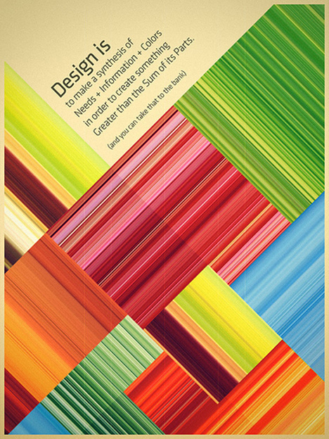
(image via: juanmateixido)
“Design is to make a synthesis of needs + information + colors in order to create something greater than the sum of its parts (and you can take that to the bank).” This poster, which won first prize, succinctly sums up what many of the other contest entrants were trying to say – and looks great, too.
Thinking Made Visual – ck/ck
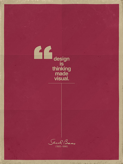
(image via: ckck)
“Design is thinking made visual.” This quote by graphic designer Saul Bass, who created a number of the most recognizable logos in the world, is illustrated here in a simple but effective composition.
So Simple and So Complicated – Horacio Lorente
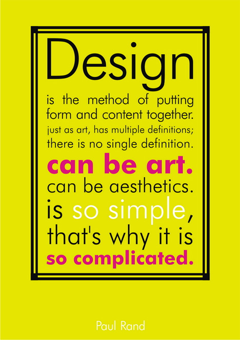
(image via: rockstudios)
Another quote by an iconic artist, Paul Rand, is brought to life through the power of graphic design. “Design is the method of putting form and content together… just as art, has multiple definitions… there is no single definition. Can be art. Can be aesthetics. Is so simple, that’s why it’s so complicated.”
Capturing the Elusive – Tony Price
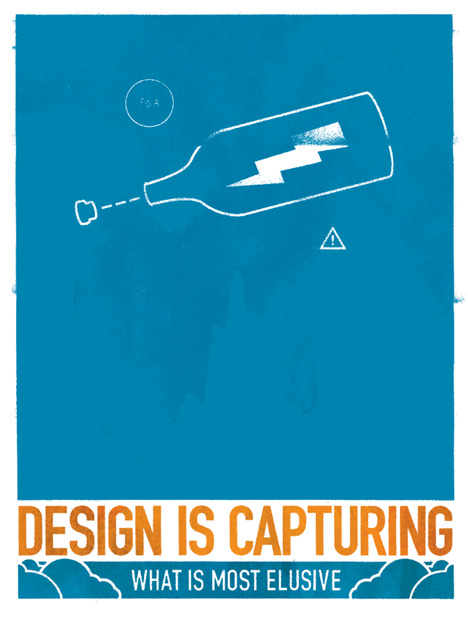
(image via: tonyxprice)
“Design is capturing what is most elusive.” So writes designer Tony Price – and what, exactly, is that elusive element? It could be said that it’s that ‘J’ne sais quoi’, that special undefinable quality that gives design power. It’s something that some artists have, and some don’t.
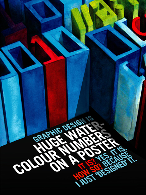
Huge Watercolor Numbers on a Poster – Drew Kora
(image via: gravitymachine)
“Graphic design is huge water-colour numbers on a poster. It is? Yes, it is. How so? Because I just ‘designed’ it.” Just as fine art can be anything you want it to be, graphic design is design purely because someone said so.
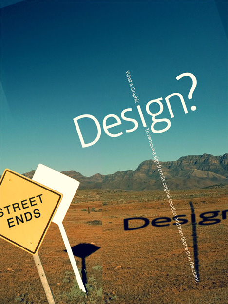
De-sign – Juanma Teixido
(image via: juanmateixido)
“What is graphic design? To remove a sign from its original location and then blame it on the client.” Designer Juanma Teixido takes the word “design” and deconstructs it to a literal meaning, finding a way to connect it back to the original subject.
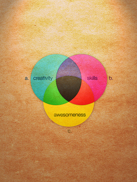
Creativity, Skills & Awesomeness – Ancient Wisdom Productions
(image via: ancientwisdom)
Creativity and skills are undeniable elements of good graphic design, but they’re not everything. To produce really standout design, you clearly need an equal amount of ‘awesomeness’ as well.
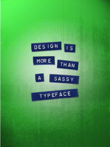
More Than a Sassy Typeface – Trev Stair
(image via: trigger25)
“Graphic design is more than a sassy typeface”. It may seem obvious, but some budding designers don’t seem to be aware of this fact.
Makes Information Less Boring – Marcus Olovsson
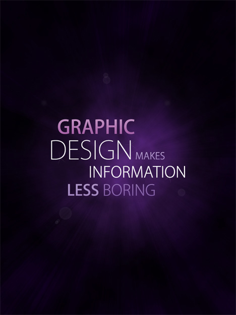
(image via: marcusolovsson)
“Graphic design makes information less boring.” Anyone who has ever tried to decipher data without the help of charts and graphics can attest to that.
Visual Balancing Act – Ben Cardy
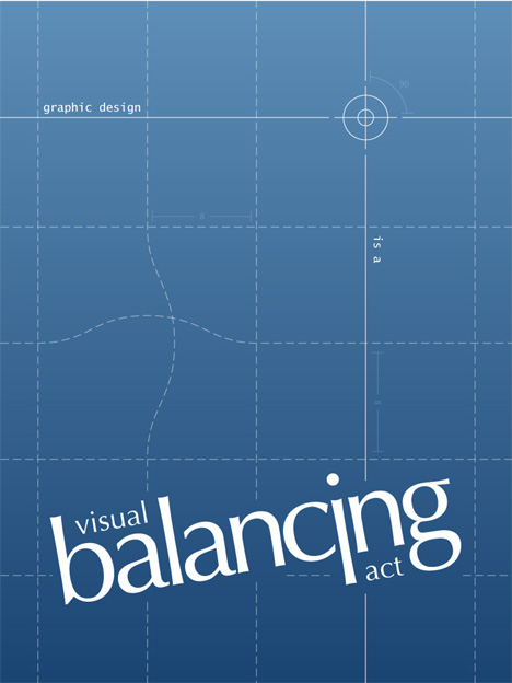
(image via: benbacardi)
When combining color, typography, lines, shapes and other elements of design, getting them to come together successfully is a visual balancing act. One small thing out of place, and the overall design doesn’t work.
Visual Discipline – Timoni Grone
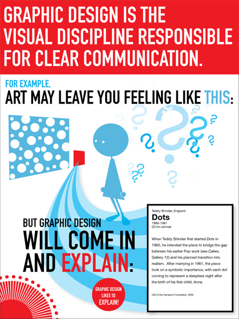
(image via: timoni)
Some people say that fine art is emotional, while design is informational. This poster by Timoni Grone illustrates the difference.
Order Out of Chaos – Janne Remes
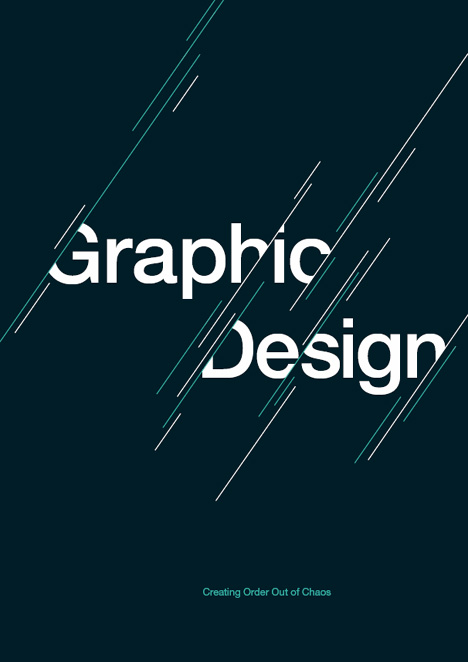
(image via: vatoslocosjkl)
Like the previous poster, this simple and clean concept emphasizes the ability of design to provide clarity.
Here Before Pixels – Alejo
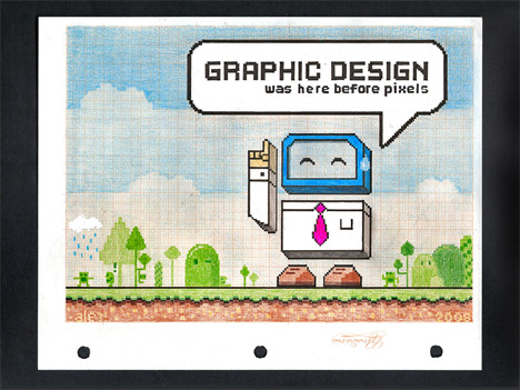
(image via: ale_dg)
Many people strongly associate graphic design with computers – but the truth is, it has been around a lot longer. This poster – “Graphic design was here before pixels” – doesn’t exactly answer the question “What is graphic design?” but it does make an important observation.
Getting the Mix Right – Elizabeth Mitchell
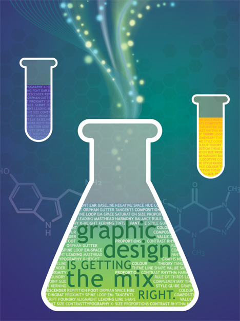
(image via: pixelfish)
Just as in chemistry, graphic design is all about getting the mix right. But instead of chemicals, designers are working with complex cocktails of shapes, lines, negative space, colors, typography, composition and other elements.
Eye Music – Pintovsky
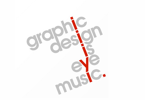
(image via: pintovsky)
Visual communications and music have more in common than you might think – things like composition, rhythm and flow. When design works, it’s like a symphony – just as pleasing to the eye as well-crafted music is to the ear.


0 comments:
Post a Comment