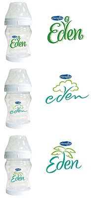
Eden is a lettering project from 2008 that I worked on for the design director at Ionic Communications. This is a good example to show concept sketches, refinements and lettering used for comp presentation.
My responsibility for this assignment was to create lettering with reference to nature. This image is the first stage of concept sketches sent to the design director. Several sketches were selected for further development to be created as vector art.

Scanned concept sketches I use for drawing templates in Adobe Illustrator are no more than quick visual reference guides. I have a tendency to change letterform shapes while drawing the vector art. A lot of script lettering I create starts as thin lines drawn over the template image. The line weight is altered to a similar thickness as the template image and changes occur along the way with small flourishes or swashes.
This screenshot shows the difference between the sketch and the vector art. The "en" combination of the sketch is too condensed and was changed while creating the vector art. Lettering has to be readable or it fails. It is very important to adjust the black and white contrast of letterforms to allow the human eye to read them.
This final image is the lettering as comp presentation created by the design director at Ionic.
Eden
Labels:
calligraphy,
hand lettering,
lettering,
logo design,
type design,
typography
Subscribe to:
Post Comments (Atom)


0 comments:
Post a Comment