This article shows interesting points of how important a logo is . The logo is the most attractive sign for your brand because it is the identity that forms the image of your brand in people minds. - Enjoy!.
Logo = identity = image = sign = Symbol= Icon
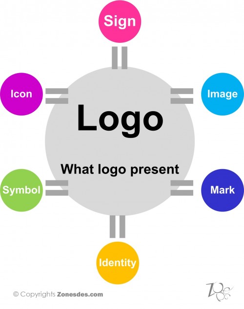
Logo is sort of mind mapping about your trademark

So when you start creating your own logo you should know how to start?
1. First of all , you must know the kind of logo you are going to create, there are No rules for choosing them, it depends on the client or the Designer.
1. Symbol Logo: Consists of Graphical symbol that represents the Brand abstractly. (like McDo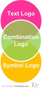 nald’s, Apple, Nike & LG)
2. Text Logo: a Word presents the Brand name in unique font or calligraphy (like Al Jazeera, ebay, Kenwood, Fedex & coca cola )
3. Combination Logo: present the Brand name as text + icon and you can use the icon only or text only of both (Pepsi, Hyundi, Adobe & ferrari) it still recognizable if you use the icon only or the text only!
2. Secondly, some Basic tips matter in logo design:
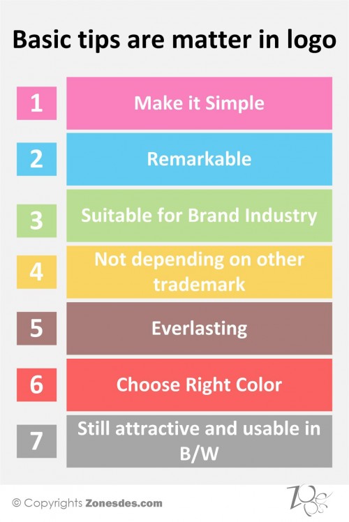
1. Make it Simple
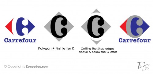
Your logo should simply present the Brand in recognizable way like Carrefour Logo.
2. Remarkable
make it simple and Easy so when you see it from a distance you recognize it .
3. Suitable for brand industry
Some logos should reflect the industry and attract people for that industry ( give them the passion).Like Costa Coffee& burger king.
4. Not fake
It is disappointing if you use a fake Trademark, it is inappropriate at all to do something like that, and believe me that will not help you to make your brand unique.
5. Not depending on other trademark
What will happen if that Trademark you are depending on has just disappeared or Bankrupt!!
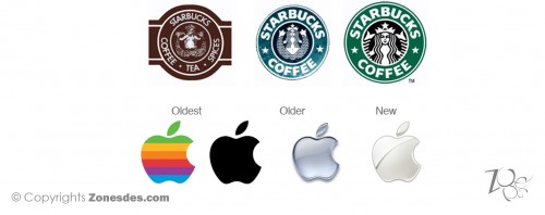
6. Everlasting
Is your logo still Great, effective& Remarkable after 5 , 10 , 20 , 30 , 50 or even 100 years!? But no harm in a quite little redesigning.
7. Choose Right Color
The matter is to choose the right color for your Brand depending on color theory
& common colors used for certain industry:
- BLUES
Authority, dignity, security, faithfulness, trust, reliability, belonging, coolness.
Deep blues: Analytical, serious. scholarly, academic, naval, regal.
Pale blues: Calm, pacific, ethereal, fresh, clean, cool. - BROWNS & BEIGES
Somber, natural, authentic, utility, earthiness, woodiness and subtle richness. - GREENS
Environmental, motion, mobility, wealth, natural, tranquillity, health, freshness. - ORANGES
Warm, cautious, hazardous, cozy, energetic, fun, cheeriness, warm exuberance. - PINK & LAVENDERS
- PINK: femininity, innocence, softness, health.
- PURPLE
Royalty, spirituality, dignity, sophistication, costliness and mystery. - RED
Aggressive, assertive, intense, strength, vitality, life-sustaining, passionate, courageous, insightful. - YELLOW
Tropical, sunlit, healing, illuminated, discovery, positivity, sunshine and cowardice.
8. Still attractive and usable in B/W
It should remain attractive & effective in black & white for stationary uses like fax or as a stamp. In fact, you should start designing the logo in Balck and White then give it the Color.
All above issues matter about logo, so trust me if your logo is unique, that will make your brand succeed & people will attach it on their own car or even tattooing it.
All Copyrights reserved to the Author Rasha Fahim. You can Hire her for your next project, see also her portfolio and some work samples below:


0 comments:
Post a Comment