I was fortunate to create this lettering for Yosi Sergent and the Get Out The Vote project.
A portion of the preliminary sketch used as a template layer for the finished lettering.
» Read More...
Preliminary color comp versions of the wall poster with off registration colors and scratchy surface texture.
» Read More...
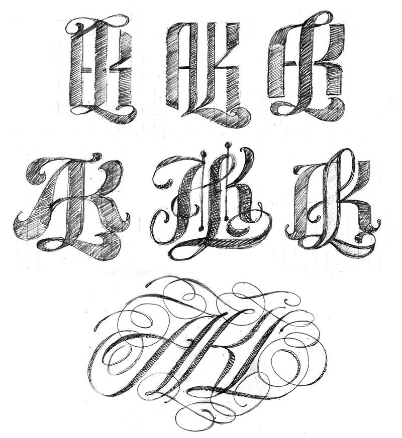
I had some more free time to continue working on the AKL logos. My 3rd logo attempt was OK but I wanted something more complex. I did some additional sketching and picked a few roughs to refine. However, none of the roughs held my interest until I began playing with a spencerian style. I did approximately 50 quick spencerian sketches and ended up with only one decent version to import as an Illustrator template. While drawing in Illustrator and zooming out to view the lettering at small scale the overall contrast was not the best so I reworked the composition over and over until I had something that held up visually.

The 3rd logo in the project.


» Read More...

This is the full color version. The background was created on a gesso texture image file with multiple layers of all the preliminary sketch studies. Every pencil line I drew to create the lettering was used. The composition changed 5 times during the process of creating this piece in an attempt to make the lettering readable.
» Read More...
I created this one to work out my frustration of not being allowed to enter any of my lettering in a exhibition as digital lettering is not allowed. From my POV, it makes no difference if lettering is made with a stick, spray can, piece of chalk, brush, marker, fountain pen, crayon or a Wacom pen. It takes more than a writing instrument to make lettering as heart, soul and personality are the real ingredients.

» Read More...
I received 3 images this afternoon and I am so pleased to see my No Kid Hungry Taste of the Nation lettering in use.
I am very fortunate to work with such talented people at this time in my lettering career. The following images are courtesy of Marco Escalante, design director for Wallace Church. Marco provided me with the sketch concept for this project. It all turned out beautiful and for a great cause.


» Read More...


A while ago i was asked by a designer I have worked with for many years to letter a pro bono logo for a charitable cause. This was a project that I gladly accepted.
The lettering was drawn In Illustrator from the designers sketch. Quite a challenge as all the letters had to be drawn in an arced configuration. I was not able to use the envelope distort filter due to the extreme distortion of x-height and curve for every letter. A lot of trial and error in vector drawing to make the logo readable. Sometimes there are no easy vector software tricks to depend on when hand lettering a logo. It becomes a matter of drawing, more drawing and a lot more drawing to get the overall color working properly.
» Read More...

I recently created a new logo for Typo-Graphical. An article showing the process can be viewed here. John also included a brief interview following the logo development process.
One of my favorite logo projects in a while and definitely an improvment from what John initially had oh his site. This logo will hold up aswell designed lettering for many years ahead.

» Read More...


Beautiful Stuff is a lettering piece for the opening image of an upcoming article featuring my work. Lot of overlays with translucent paper to figure out the flow and compostion. Additional changes happened while lettering in Illustrator.
» Read More...
Just some late evening practice in the hope of getting good at writing fluent letters and words some day.


» Read More...

Passion is my script practice for today. A few quick rhythm studies and one overlay sketch for use as a template in Illustrator. Even though I start with a template everything changes as I draw in vector. Its the process of drawing live in Illustrator and going with what feels natural. Quite different than previous attempts at this style a number of years ago. All of the swash lines are naturally happening in the same manner as when I sketch with a marker on paper.


The overlay sketch used as the drawing template.
» Read More...

Finally got the CD art ready to go for my brother Rick who requested that a dragon nano be included in both his CD design and logo. The next step of this project iwill be the embroidered jacket which I will pick up from the stiching shop early next week.
» Read More...
Last week I was asked to write the word Confidence in a loose hand writing style for use on a large size banner about 6 feet long. To produce this lettering style I first had to understand how to compose the letters in a fluent manner.

I wrote the word a number of times on a small note tablet with pencil and pen. No matter how many years I have been lettering I never have an immediate answer. I go thru a trial and error process and eventually everything falls in place.


After the initial roughs I understood the rhythm and flow of the letters. I grabbed a PITT big brush pen and wrote the word at a larger size on a piece of 11" X 17' layout paper which was scanned and imported into Photoshop. I used the gaussian blur filter to smooth the letter shapes, posterized the image and saved the image as a 40" X 25" 75 dpi B/W bitmap file. The bitmap file was imported into Illustrator as a template to create the vector art.

» Read More...
Healthy Choice is a lettering project I was involved with approximately 2 years ago. I worked with a group of designers at Brandimage - Desgrippes & Laga refining their concept sketches including some of my own.

These are some of my rough sketches used to produce a closed in series of logos.

During a late night sketching session I started to think about the combination of sans serif with semi script letter forms. Specifically the e, a and c. By including letters that had a open script style the logo got some personality it lacked in previous attempts.
With a solid sketch I produced the vector version and sent it to the creative director. The logo was accepted and some versions were later produced that enclosed the letters in an oval. The final logo of the product line was the version with no oval enclosure.

Several months after working on the project I saw the product line when I was in the grocery store. I noticed that 2 small changes were made internally by the CD with a curved cross stroke of the cap H and a longer ligature of the lowercase y. Both excellent improvements to the logo.
This was a unique project to work on and one that gave me the chance to design a sans semi script type style for a logo printed on an extensive food packaging line.

» Read More...