
Preliminary color comp versions of the wall poster with off registration colors and scratchy surface texture.
» Read More...
» Read More...


» Read More...


» Read More...


» Read More...
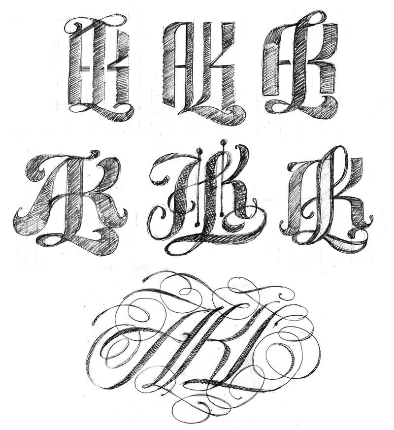
I had some more free time to continue working on the AKL logos. My 3rd logo attempt was OK but I wanted something more complex. I did some additional sketching and picked a few roughs to refine. However, none of the roughs held my interest until I began playing with a spencerian style. I did approximately 50 quick spencerian sketches and ended up with only one decent version to import as an Illustrator template. While drawing in Illustrator and zooming out to view the lettering at small scale the overall contrast was not the best so I reworked the composition over and over until I had something that held up visually.
The 3rd logo in the project.
» Read More...

AKL is a logo I created for Arno Karthollnig Lettering. Basically a fun little lettering project to do while enjoying a break from recent commercial deadlines.
My first logo attempt turned out OK but I had some reservations about the legibility with a close lockup of all 3 letters.
The initial sketches were studies of 3 combined letterforms A, K & L. I used a PITT brush maker and knocked out a bunch of roughs. I taped them to my office wall for review and selected several to scan and import for use as a drawing template. My intention was not to duplicate the rough letter shapes in Illustrator. The template was nothjing more than a visual reference starting point.
I posted the logo on Dribble and a fellow lettering artist commented the logo read as "AIR". At that point I thought it best to separate the K & L and redesign the piece with perhaps more elegance. I drew another rough and and started over in Illustrator. The second logo attempt turned out rather nice compared to my first effort.
» Read More...

Last March I was contacted by Ink Butter to develop a logo for a skin care product they planned to launch this year.
The original logo concept Ink Butter sent to me was a good starting point but rather difficult to read. As modified set
type it had no unique identity.
Knowing the logo was to be printed on a small 2 oz. bottle I began sketching concepts with minimal flourishes and a lockup of the cap I & B. The sketches were produced with pencil and Pitt marker brush. As with most lettering projects all the concept sketching is a trial and error process best defined as making many visual mistakes to find answers and solutions. 
After the first series of sketches I had to concentrate on letter specific flourishes and additional development of cap IB lockup.
A series of 5 concept sketches were selected for presentation. The 2 versions on the right of this image were selected and elements of each were combined to create the drawing template for Illustrator.
The Ink Butter logo is currently in use on both the product bottle and website. It looks beautiful and is one of my all time lettering career favorites.
» Read More...
I received 3 images this afternoon and I am so pleased to see my No Kid Hungry Taste of the Nation lettering in use.
I am very fortunate to work with such talented people at this time in my lettering career. The following images are courtesy of Marco Escalante, design director for Wallace Church. Marco provided me with the sketch concept for this project. It all turned out beautiful and for a great cause.


» Read More...


A while ago i was asked by a designer I have worked with for many years to letter a pro bono logo for a charitable cause. This was a project that I gladly accepted.
The lettering was drawn In Illustrator from the designers sketch. Quite a challenge as all the letters had to be drawn in an arced configuration. I was not able to use the envelope distort filter due to the extreme distortion of x-height and curve for every letter. A lot of trial and error in vector drawing to make the logo readable. Sometimes there are no easy vector software tricks to depend on when hand lettering a logo. It becomes a matter of drawing, more drawing and a lot more drawing to get the overall color working properly.
» Read More...

I recently created a new logo for Typo-Graphical. An article showing the process can be viewed here. John also included a brief interview following the logo development process.
One of my favorite logo projects in a while and definitely an improvment from what John initially had oh his site. This logo will hold up aswell designed lettering for many years ahead.
» Read More...

Yes Sir is my attempt at a formal script sample. Something a bit more commercial than a freeform gestural script.


I started with a loose pencil sketch to set up the basic vector lines. As the compostion progressed I strayed from the sktech to make all the letters readable. Eventually I toned down the flourishes and added a inline give the letters some depth. The initial vector draft was a bit too complex.
» Read More...

Carpe Diem was a cool project and the lettering is now on apparel at Random Objects.
This Project was recently featured in InPrint showing all the concept sketches. When I letter in vector format I start with single weight strokes to develop structure of the letters including spacial relationships. This is no different than drawing with a pencil or marker on a sheet of tissue paper. A lot of trial and error happens in this stage.
Once the composition reads properly I will shape each letter with bezier curves to create the desired thicks and thins. 
» Read More...
The Annie Mulz logo script is a recent project. I had a lot of fun with this one all the way from the concepts to the finished lettering.
After review of the concepts this version was refined with a PITT brush marker and used as a template in Illustrator. I decided to alter the cap M shape slightly for better visual match with cap A. 

The logo can be viewed at the website along with some very cool stuff.
» Read More...
Albanese was a lettering project for a local client at the beginning of 2011. This was a project which required a lot of sketching in a quick time frame to develop a brandmark for a chocolate product.
I often tell people that that drawing skills are essential. When I start a project I do a lot of preliminary studies to learn the letterforms. I am not creating detailed drawings as all the precise draftsmanship happens while drawing in Adobe illustrator. I rarely spend more than a couple minutes per sketch. Basically a lot of quick investigation of what may work for readability.
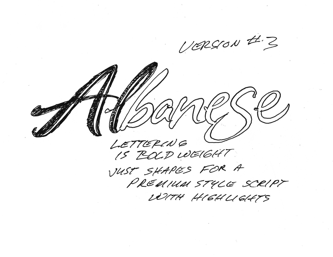
This series of sketches was done with a PITT marker on sheets of 9" X 12" layout paper. I drew these studies while sitting at the kitchen table eating lunch. Only had a couple hours get some ideas together on paper for a quick presentation with the art director. After all the trial and error studies I picked versions which had some potential for further development, traced them while adding notes for the AD to read. After sacnning the layouts I e-mailed the files for presentation.
These are the images sent to the AD. After he reviewed everything we discussed which versions to develop in Illustrator.



This image shows the vector versions created from the sketches.
After sending the vector art files to the AD I created one more version that had nice flow and contrast. Something extra as another option for the AD.
Overall, this was a very successful project. The images show that drawing is an important part of the lettering process. Sketching is the way to find out in a very quick time frame what will and will not work. Concept sketching also allows the opportunity to show a client what is possible instead of guessing what finished art might be. 
» Read More...


