I was fortunate to create this lettering for Yosi Sergent and the Get Out The Vote project.
A portion of the preliminary sketch used as a template layer for the finished lettering.
» Read More...
Preliminary color comp versions of the wall poster with off registration colors and scratchy surface texture.
» Read More...
Earlier this year I worked on a logo project for My Social Brand.
http://www.my-social-brand.com/
What made this a challenging logo to produce was the client request that each word be surrounded by interlocking talk bubbles. After a concept sketch was selected for vector I did some additional sketching to figure out the rough shape and position of the individual letters. The sketch was imported to Illustrator to use as a reference guide. I had to make numerous adjustments during the vector drawing process as the logo was going to used for repro from small to large sizes. I quite often view the logo in reverse to avoid any odd contrast.
» Read More...
Ellis Brown was script logo project with retro influence. I looked at some 50's and 60's style lettering for reference and drew a series of roughs for presentation. This was one of those "need it yesterday" commercial lettering projects with not much time to produce the sketches or vector lettering.
The client selected the bottom version with the request that both words be centered. A quick Photoshop modification was applied to the selected rough on the bottom right.
The modified sketch image was used as a template in Illustrator. The template was only a starting point to provide reference for the basic shape of the letters.
» Read More...
Tejas is a recent lettering project. A good example of sketching and contrast development. In my younger days I learned from a master designer that one of the key elements of lettering is black and white contrast. To this day I often work in reverse with white letters on a black background. I use this method to fine tune the overall contrast by closing gaps.
The client sent me a rough draft of Texas which had some problems. The contrast was off balance with thicks of the e, a and s which overpowered the vertical weight of the j and a. There was nothing unique in the cap T or j.
The only way to properly develop Tejas was to spend time rough sketching. Sketching is the ultimate skill to find answers for what may or may not work. After some time with pencil and paper I developed the circled version which definitely had some potential for vector lettering. The client select 2 versions to refine in vector format.
» Read More...

Another quick practice study with a Condor fountain pen. When I attempt this style with a Speedball C4 nib I end up tearing the paper with the nib or getting a stray stroke. I may have have too heavy of a hand for Speedball nibs. With the Condor fountain pen I can push into the surface of the paper or barley touch the surface
» Read More...

My New Year greeting to everyone.
» Read More...
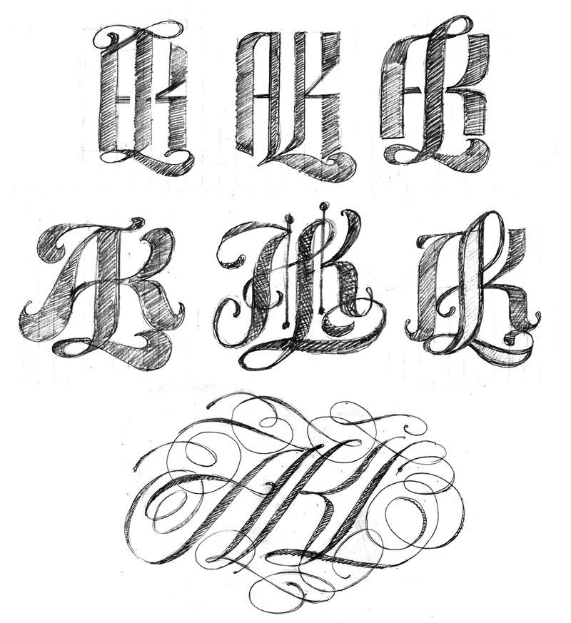
I had some more free time to continue working on the AKL logos. My 3rd logo attempt was OK but I wanted something more complex. I did some additional sketching and picked a few roughs to refine. However, none of the roughs held my interest until I began playing with a spencerian style. I did approximately 50 quick spencerian sketches and ended up with only one decent version to import as an Illustrator template. While drawing in Illustrator and zooming out to view the lettering at small scale the overall contrast was not the best so I reworked the composition over and over until I had something that held up visually.

The 3rd logo in the project.


» Read More...
I received 3 images this afternoon and I am so pleased to see my No Kid Hungry Taste of the Nation lettering in use.
I am very fortunate to work with such talented people at this time in my lettering career. The following images are courtesy of Marco Escalante, design director for Wallace Church. Marco provided me with the sketch concept for this project. It all turned out beautiful and for a great cause.


» Read More...


A while ago i was asked by a designer I have worked with for many years to letter a pro bono logo for a charitable cause. This was a project that I gladly accepted.
The lettering was drawn In Illustrator from the designers sketch. Quite a challenge as all the letters had to be drawn in an arced configuration. I was not able to use the envelope distort filter due to the extreme distortion of x-height and curve for every letter. A lot of trial and error in vector drawing to make the logo readable. Sometimes there are no easy vector software tricks to depend on when hand lettering a logo. It becomes a matter of drawing, more drawing and a lot more drawing to get the overall color working properly.
» Read More...

I recently created a new logo for Typo-Graphical. An article showing the process can be viewed here. John also included a brief interview following the logo development process.
One of my favorite logo projects in a while and definitely an improvment from what John initially had oh his site. This logo will hold up aswell designed lettering for many years ahead.

» Read More...
happy friday! introducing our happy things...we are going to share a collection of images we have found throughout the week that make us smile. this week: some fun and oh so pretty lettering!
{a} since the phillies are doing so great, this superduper graphic philly phanatic tank from
cheesesteak tees;
{b} the loveliest stamp debuts in 2012. perfect for a wedding invite (designed by
jessica hische);
{c} modern weave's most colorful
life is good print. just so vibrant and happy (found this via
the pink chalkboard blog, a fave of ours!);
{d} a beautifully framed image of
orange beautiful's eat drink & be married print
(image by
marianne taylor photography);
{e} our most favorite find of the week,
audrey. a whimsical cursive font by our new pal
lindsey b!
» Read More...