 Leather. Yep! Just a peek at one of the fab pieces we're putting together for what is sure to be an amazing fall wedding for Holly & Randy.
We designed a monogram turned it into a custom leather stamp ... then hand-stained leather {yes, my hands are completely stained! next time, gloves!} made into a monogram tag to adorn the front of the invitations.
Leather is such a great medium to work in! There are tons of stain colors available, tools, decorative stamps ... just some really fun stuff. I have such an appreciation for the artisans who work in this medium! Can't wait to experiment some more!!
More to share from this wedding in a few months ... keep visiting!
» Read More...


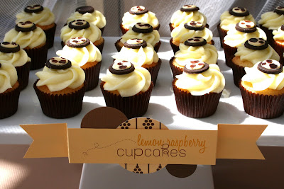
Wanted to share this super-sweet Giraffe Baby Shower from May! Soft buttercream, chocolate & white color palette goes well with all the delectable desserts from
Sweet Cakes by Rebecca.
By the team at SJD ... invitations, dessert tags, tissue paper pom poms {loved mixing up two-tone tissue colors instead of just solids!} and Hello Baby! pennant.
Amazing dessert spread as usual that included ... vanilla cream puffs, panna cotta, chocolate marshmallows, giraffe cookies {that were designed to match the invite to perfection!}, lemon & raspberry cupcakes, lemon bars, chocolate cake pops, chocolate cupcakes and the most adorable strawberry shortcake topped with a sculpted giraffe.
Enjoy!
» Read More...


I've mentioned how much I love when previous brides call for baby shower & birthday papery for their growing families ... and Lainey's parents are no exception!!! Love them!
Ladybugs set the stage for Lainey's first birthday celebration this past weekend. I had the pleasure of creating invitations, pennant and {Yes! You see them!!!} a tissue pom pom party-pack complete with custom Ladybug poms!!!
Our Ladybug PomThingy's are up on my
Etsy shop now!
These tissue ladybugs are the first of their kind and can be found only at SJD!! Yep we're the first to take tissue pom poms to the next level ... and we've got lots more PomThingy's {that's what I'm calling these little critters!} to post over the next several weeks.
Happy, Happy 1st Birthday Lainey!!
» Read More...
 Ummmm, yea. The latest issue of Sacramento Magazine's Our Wedding hit stands about a month ago, but in the hustle and bustle of our recent move I just haven't had a chance to post a pic from the mag. Finally, a little moment and voila! here it is.
The two invites featured by Stephanie J Designs are top left {black and fuchsia} and bottom right {champagne and fuchsia}. Absolutely adored both invites and the inspirations behind them. The
Barn Chic Papery {bottom right} has been featured on the blog previously. And I have yet to do a little post on the black and fuchsia one ... still thinking of what to name it!! Lol!
Side note: papery is not easy to shoot and Gabriel Teague {the Our Wedding photographer responsible for the layout & photo} did a fantastic job of capturing the details!!
Lots o' love to Sacramento Magazine's Our Wedding for thinking we're fab!!
» Read More...

Sometimes ... I have to wait a whole year before I can share what I've been working on!! And that can be realllllly difficult for someone who isn't all that great with waiting to share my day-to-day design projects. Don't want to give away dates, details & locations before my clients big days take place!
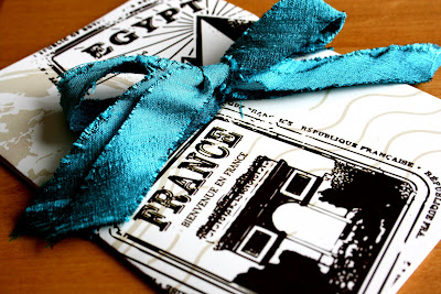
That brings us to this little invitation! When Marianne contacted me from {literally!} the other side of the world to create her wedding day invitations I was thrilled! She was referred to me by one of my clients from 2009 that had nuptials in India. Love, love, love working with clients abroad! Definitely gives you some perspective when you're working on a map detailing the Indian Ocean, Paris, Madagascar to name a few - the world is much, much grander than my little bubble of Northern California.
For Marianne and Olivier it was a merging of France & Egypt ... they were looking for something to bring together their origins and how they got to where they are today. Thus, an emotional map of sorts! Taking guests on a little tour of where they were each born, grew up, went off to school, where they met, where Olivier proposed, etc. ... all the way to where the wedding would be held.
And ... I got to stretch my 4 years of high school French {with a lot of help from Olivier}!! Because the invitations were made in English and French. Soooo much fun!
Congrats Marianne & Olivier!!
» Read More...
The pics for the final table I worked on at Lavish and Fabulous are up on the website! I can't grab pics to post here on my blog for some reason ... sooooo you'll have to hop on over here to view.
Items created by SJD included an invitation, banner and place cards.
The front of the boxed invitation was designed with a feathered boa, taffeta ribbon bow and gold filagree heart pendant with a Swarovski Rivioli crystal. Inside, the invitation was mounted on a layer of black and antiqued ivory paper. The interior top and bottom of the box was tailored with a luxurious pin-tucked taffeta fabric.
The little banner shouted, "CAN! CAN! CAN!" with feather boas and ribbon tying the individual panels together. Came out super-cute!
Place cards were set beneath an acrylic table top and set down into the floral table ... really an awesome effect! Each place card had a giant golden shadow Swarovski Rivioli crystal set atop a ribbon sash.
Below are the amazing vendors that made this vignette come together ...
» Read More...

Remember that glam event I mentioned a week or so ago?? Pics are rolling in!!! First up ... the All You Need Is Love Vignette.
This space is inspired by the TV show Mad Men on AMC. The design for this room started with the daisy theme chandelier that was found at Ikea and really took over from there. Combining the fab era’s of the 50′s and 60′s and a twist of 2010 into one amazing retro chic vignette.
I had such a blast creating the invitation, menus, place cards, poster, dessert bar tags and hand-sewn fabric flower pom-poms for this spread!!!
The boxed invitation was hand-finished in a modern-yet-retro black and white fabric, inside was finished with a yellow and white polka-dot fabric with the paper part of the invitation in matte black and white. The front of the invitation was finished off with a thick black double-faced satin ribbon and a little yellow and white polka-dot fabric flower pom-pom.
The menu's were affixed to each one of the individual floral arrangements placed at each place setting. Fab idea from Katie with Ambience!
Place card - slash - snazzy soda-pop beverage! Oh, yeah. Super-cute floral fabric pom-poms were attached to each of the soda pop bottles in alternating black/white and yellow combinations. The actual little place card flag was attached to the vintage green and white paper straws. You know I am a huge fan of those little straws!!
Poster! What can I say? Measures 24x36 affixed to foamcore for stability on a matte bright white paper. I am such a fan of pop-art and this added just a little touch of whimsy to Rebecca's {with Sweet Cakes by Rebecca} aaaaamazing dessert bar. The dessert bar tags came out super cute too - I created those in alternating yellow/white and black/white to mix it all up a bit. Rebecca and I were emailing into the wee hours making sure no detail was overlooked - hello!! the couples monogram is even on the sugar cookies!!! Love.
My absolute favorite ... would have to be those little fabric flower pom-poms!! Soooo, much fun to make ... look for them soon in the SJD Shop!! We're planning on making 4 different sizes to choose from.
Below are the amazing vendors that made this vignette come together ...
» Read More...
 Leather. Yep! Just a peek at one of the fab pieces we're putting together for what is sure to be an amazing fall wedding for Holly & Randy.


